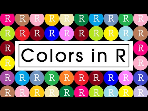
How to Create Correlation Plots in R

The Data Digest
View ChannelAbout
Welcome to the data digest, a channel dedicated to data analysis with the R programming language. Join me in the journey to master the various aspect of data analysis: * Visualizations * Programming * Exploratory Data Analysis * Statistics and Modelling * Communication of Results
Video Description
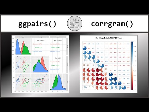
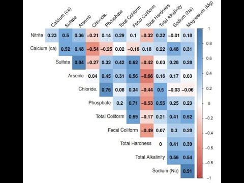
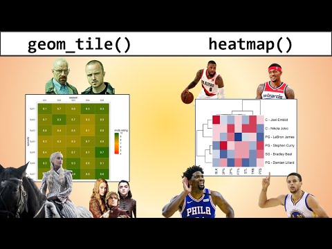
In this tutorial I show you how you can create Correlation Plots in R with various functions from different packages. If you want to learn data visualization with R and ggplot, you can support me by using this link: https://datacamp.pxf.io/raJrdy If you want to take an intermediate data visualization course, you can support me by using this link: https://datacamp.pxf.io/2agY1z You can download the R code for free here: https://www.skool.com/data-analysis-with-r-6607/classroom/daa88316?md=e32411294ee7464d90d07527746fb9dc Namely the corrplot, GGally, corrgram and psych packages. Often you can add distribution charts like histograms or density plots as well as scatter plots to these correlograms. ⏱ Time Stamps ⌚ 0:00 - Intro and video overview 0:37 - corrplot() 5:20 - ggpairs() from GGally 6:23 - ggcorr() from GGally 7:15 - corrgram() 9:06 - pairs.panels() and corPlot() from psych 11:41 - geom_tile() and other functions External Links: https://www.r-graph-gallery.com/correlogram.html https://cran.r-project.org/web/packages/corrgram/vignettes/corrgram_examples.html https://r-coder.com/correlation-plot-r/ http://www.sthda.com/english/wiki/ggally-r-package-extension-to-ggplot2-for-correlation-matrix-and-survival-plots-r-software-and-data-visualization http://www.sthda.com/english/wiki/visualize-correlation-matrix-using-correlogram https://www.r-bloggers.com/2021/06/ggpairs-in-r-a-brief-introduction-to-ggpairs/


![Ridgeline plots in R with geom_ridgeline() and geom_density_ridges() [R- Graph Gallery Tutorial]](https://imgz.pc97.com/?width=500&fit=cover&image=https://i.ytimg.com/vi/war1H2xxazQ/hqdefault.jpg)


Bake Like A Pro Today
AI-recommended products based on this video

Environet Hydroponic Growing Kit, Self-Watering Mason Jar Herb Garden Starter Kit Indoor, Windowsill Herb Garden, Grow Your Own Herbs from Organic Seeds (Basil)

Herb Garden Planter Indoor Kit 21Pcs Kitchen Herb Garden Starter Kit Growing Kit Including Wooden Box Burlap Pots Soil Discs Gardening Tools Unique Easter Birthday Christmas Gift Ideas for Women Mom

Bonsai Starter Kit – 1x Bonsai Tree | Complete Indoor Starter Kit for Growing Plants with Bonsai Seeds, Tools & Planters – Gardening Gifts for Women & Men

Freenove Ultimate Starter Kit for BBC micro bit (V2 Included), 316-Page Detailed Tutorial, 225 Items, 44 Projects, Blocks and Python Code
