The Overlooked Visual Design of The Phantom Menace

Midnight SP
@midnight_spectacleAbout
I like F-Zero GX, I like Knuckles Chaotix for the 32X, I like plain flavored donuts, and that's about it. Channel Icon an edit of "Branded to Kill" poster by Tony Stella: https://www.tony-stella.com/
Latest Posts
No results found. Try different keywords.
Video Description
Letterboxd: https://letterboxd.com/crackersncheese/ Phantom Menace: A Visual Deep-Dive into Star Wars’ Most Colorful Movie Why does Episode I look so unlike every other Star Wars? George Lucas traded the Original Trilogy’s greys for bold color, Art Nouveau Naboo, lavish costume work, and wildly original creature/vehicle design. This video essay breaks down the production art, interviews, and concept work (Doug Chiang, Iain McCaig, Terryl Whitlatch) to explain how Naboo’s chrome N-1 starfighters, Otoh Gunga’s glowing city, Amidala’s runway-level wardrobes, the pod-racers, and Darth Maul’s mythic iconography were conceived, and why those choices still matter for Star Wars’ visual language. Tags: Phantom Menace analysis, Star Wars design, George Lucas vision, Naboo Art Nouveau, Queen Amidala costumes, Doug Chiang, Iain McCaig, Terryl Whitlatch, Darth Maul concept art, Podracer design, Otoh Gunga explained, Star Wars production design, Prequel trilogy analysis, Star Wars concept art, Phantom Menace visuals, Video essay, Film analysis, Movie essay, Star Wars aesthetics, Droideka design
Star Wars Fan's Must-Have Gear
AI-recommended products based on this video

LIGHTAILING Light for Lego-75379 R2-D2 - Led Lighting Kit Compatible with Lego Building Blocks Model - NOT Included The Model Set

STAR WARS Women's Force is Strong with This One Racerback Tank Top

LIGHTAILING Light for Lego-75379 R2-D2 - Led Lighting Kit Compatible with Lego Building Blocks Model - NOT Included The Model Set

Airbrush Kit with Air Tank Compressor 2 Dual-Action Gravity Airbrush with 0.2mm 0.3mm 0.5mm Nozzle Air Compressor with Airbrush Coloring Tool Cleaning Brush for Model Paint Hobby Craft

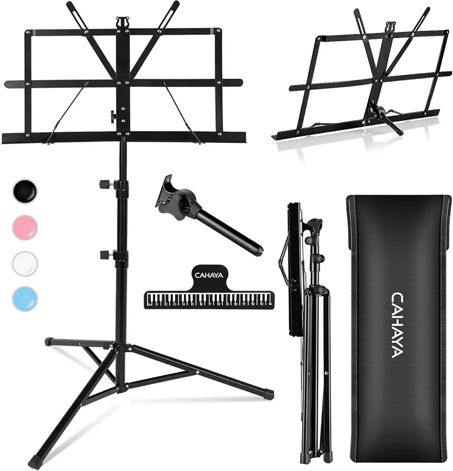
CAHAYA Portable Sheet Music Stand: Dual Use Desktop Book Holder Folding Lightweight Extra Stable Reinforced with Carrying Bag and Clip for Students Musicians Height Adjustable up to 54.3" CMS0204
